Monday, January 31, 2011

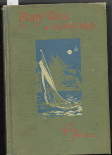
1974 The Folio Society Edition, Moby Dick

Illustrated by Garrick Salisbury Palmer, this edition is lush and elegant. Mr. Palmer's woodcut illustrations are tight and oddly radiant.

There are two copies of the Folio Society edition of Moby-Dick in the collection and this is the description of the first aquisition:

Herman Melville: Moby Dick The Folio Society, London 1974, First Thus. 515pp. Very Good in decorative cloth boards. Wood engravings by Garrick Palmer. Seems to be a bit of discolouration to lower part of spine, possibly water damage (there is a mark on the corresponding part of the slip case), apart from this would be fine.

Captain Ahab is clearly deranged and given the way Garrick Palmer has chosen to render skin, he appears to have a tooth ache, no doubt causing more pain.

Thursday, January 27, 2011

1943, the Heritage Press, Moby Dick, illustrated by Boardman Robinson


Boardman Robinson, born in Nova Scotia, lived from 1876 to 1952, was an illustrator, muralist and cartoonist.

Teacher at the Art Students League, in NYC, it comes as no surprise, given the devastation of WWI, he was a socialist, working on the socalist monthly, The Masses.

In the introduction, of the Heritage Press edition, written by Clifton Fadiman, is the following:

"No one on the Pequod... can overcome his fear of Ahab because the fear is seated in himself. His Ahab-fear is a fear of himself, or rather the pit of blackness, the central dark mother-lode of despair which every man at times knows to be within him."

Robinson's Ahab is a dark mother-lode of despair.


Wednesday, January 26, 2011

1942 Dodd, Mead and Company MOBY-DICK

The 1942 Dodd, Mead and Company, Moby-Dick, was lavishlly illustratated by Mead Schaeffer (1898-1980). Mr. Schaeffer was 24 when he was hired to illustrate this novel as well as Typee and Omoo.

He later focused on fine art and took commissions from magazines for cover work.
Interestingly, he was a personal friend of Norman Rockwell and he and his family often posed for many of Rockwell's illustrations and paintings. - (Wikipedia)

This copy in the collection is classic, in that some child sometime read the book, leaving his teeth marks on the corners.

Moby-Dick
Schaeffer chose to illustrate Ahab at the moment he confronts Starbuck with his musket and Starbuck warns: "beware of thyself, old man."

Personally, I love the illustration of Queequeg standing on a whale fast against the Peguod, guarding the catch from the sharks, one of which is clearly larger than Queequeg himself.

When done with the Ahab series, we will examine all of the images for Queequeg, a fascinating proposition...!!


Moby-Dick


Tuesday, January 25, 2011

1933 Albert & Charles Boni, Inc.


The Raymond Bishop illustration of Ahab.

Between pages 108 and 109, in chapter XXVIII, Ahab.

Striking is his grimace, and the odd stool decorated with wave like embellishments. The fact that the stool appears to be almost too small, sets up a tension in the graphic.

Bishop presents Ahab as tall and lanky, but clearly troubled with the image of the white whale, MOBY DICK, in the fog of his imagination, or is that the smoke of his pipe, recalling the Kent illustration.

This illustrated edition, chronicled in an earlier post, was placed on the market, several years after the Kent, perhaps the Boni Brothers were interested in coat-tailing on the success of Random House's edition.

There will never be an electronic image as satisfying as this printed paper image, alas.

Monday, January 24, 2011

1931 Saalfield Every Child's Library Moby-Dick

Ahab, ready to strike.


MOBY DICK. Melville, Herman; Saalfield Publishing Co; NY; 1931. Hardcover with no jacket. Edge wear and surface rubbing; pages tanned, tightly bound.


Cover : Green Cloth 6 x 8 1?4

Spine not marked ILLUSTRATED and line

1 5/8 thick

309 ppgs

Frontice Illustration by C Lawson

Friday, January 21, 2011

1930 Random House Moby-Dick

The classic Rockwell Kent illustrated edition. #21 in the collection, purchased on Ebay.

New York, Random House, 1930. First trade edition. Thick small 8vo. 280 woodcut illustrations (including chapter headings and tailpieces), spine, upper cover illustrations by Rockwell Kent. Original black pictorial cloth stamped in silver. NEAR FINE, fresh bright copy with minor rub to cover stamping a
bove whales head, lower tips little bumped. No signatures or bookplates. Nice copy of a handsome edition of this classic.

I have choosen this edition to begin a series of postings of the illustrated books in the collection. And specifically, Kent's choice to introduce an Ahab illustration in Chapter XXX, is classic: no peg leg, no crazy eyes, just Ahab in a strangely pedestrian hat, pondering his pipe and its addiction, just before heaving it over board, in a way denying himself its pleasure....


Thursday, January 20, 2011

1967 Norton Critical Edition - Paperback Moby Dick


One of the most common phrases people speak after seeing the Moby-Dick Collection is: Its all the same book right!

They are perplexed, "its the same words, so how many do you need?"

But are they the same words? Not entirely.

For a moment regard the 1967 Norton Critical Edition of Moby-Dick, as an example, nothing special about it, in fact this copy has A. Hawley signed in red pen on the inside, the cover is broken, and judging by the overall condition, A. Hawley probably never finished reading it...

His or her markings and underlinings stop at page 26, therefore he or she never made it to page 44 to read the words of the hymn read by Father Maple, and specifically un read is the first line of the second stanza: "I saw the open maw of Hell..."

Maw: The mouth, stomach, jaws, or gullet of a voracious animal, especially a carnivore.

Heck of an image, the open mouth of Hell ready to receive the offering...

Checking the 1919 Page Edition of Moby-Dick, already posted, the hymn is on page 43, and the first line of the second stanza reads: "I saw the opening maw of Hell...."

Open vs Opening. Still heck of an image. This edition carries the Copyright, 1892 Elizabeth S. Melville. So presumably this is the "official" text.

Furthermore, checking the Northwestern-Newberry Edition of Moby-Dick, page 42 has the opening line of the second stanza: "I saw the opening maw of Hell....". From the back cover: "The aim of this edition of Moby-Dick, ... is to present a text as close to the author's intention as surviving evidence permits."

Conclusion: The Norton text is in error. This may or may not be a typo, every other Norton Edition has the same wording, and in no other printed text can this wording be found.


1967 Norton Critical text


1919 Page text


1988 Northwestern- Newberry text.
Both the Norton and Northwestern edidtions were edited by Harrison Hayford.


Tuesday, January 18, 2011

1970 Icelandic Language Moby-Dick

Kallio mig Ismael!

1970 Almenna Bokafelagid, publisher, cover by Torfi Jonsson

Cover: Brown /w gold lettering, 6 1/4 x 9 1/4 x 1 1/4
478 ppgs

Purchased on EBAY for $30 in 2000, this MOBY-DICK, would be one of my most prized books in the collection, and the first foreign language book I bought.

Perhaps, after buying this book I realized that this collection was actually something to behold, for each time I have opened the bookcase to visitors, I have shown them this book.

We Americans, sadly, can be a funny lot. Sometimes I get the impression that it is in seeing this book that folks realize that people in other lands actually read and read books not printed in the English Language. "Oh that is odd, Icelandic? Gezz I guess they must have books in their own language." That is the kind of response I get. With a literacy rate of almost 100%, (2010 CIA WORLD FACTBOOK), the Icelandic people are the most literate and well read people of us all.


Monday, January 17, 2011

1931 Saalfield Every Child's Library Moby-Dick


In 1900 Arthur J. Saalfield founded Saalfield Publishing Company in Akron, Ohio, which from that date to 1977 published children's books.

The Archives of the Saalfild Publishing Company were purchased by Kent State University and housed there.

This edition was illustrated by Alfred Conyers, with seven illustrations, contains 309 printed pages.

Details:
Light blue cloth covers with dust jacket
measures 5 1/4 in by 7 5/8 in and is 1 1/4 inch thick.
Spine is market ILLUSTRATED with a line


Here are 5 copies of Saalfield Moby-Dick's, all Identical with the exception of size and color of the binding.


For later inclusion I am preparing a series of posts of the various illustrations of Ahab.

Friday, January 14, 2011

Solar Flare and your Kindle

This is a beautiful little picture.

Shortly after the solar flare goes screaming thru your body, these little books will be sitting there all complacent and ready to be read. Not so your electronic copy of Moby-Dick.

Granted its just one book, but hey, I never forgot seeing Fahrenheit 451 in high school.

A bit of information about solar flares.

"In modern times, the largest solar flare measured with instruments occurred on November 4, 2003 (initially measured at X28 and later upgraded to X45).[8][9] Other large solar flares also occurred on April 2, 2001 (X20), October 28, 2003 (X17) and September 7, 2005 (X17).[10] In 1989, during former solar cycle 22 two large flares occurred in March, 6 (X15) and August, 16 (X20) causing disruptions in electric grids and computer systems.[11] A complete list is available at http://www.spaceweather.com/solarflares/topflares.html"

The above taken from the Wikipedia article on solar flares.

Just because we can make something does not mean it is worthwhile. I listened to a friend discuss the merits of reading in bed with her Kindle and travelling with her kindle and that all seemed to make sense. So good for her..

But for me.. nothing will replace the look, feel and smell of a good book... and I can handle a book in bed, and carry a few extra pounds of carry on. I am not that much of a woss...

Just my opinion.

I want to take a moment to thank Matt Kish for the shout out on his blog One Drawing for every page of MOBY-Dick. If you have not seen his blog, it is worth a look!


Thursday, January 13, 2011

1919 Page Company, Boston Moby-Dick

Moby-Dick
ON the left is the 1922 The St. Botolph Society Edition, Moby-Dick (see earlier post) and on the right is the 1919 Page Company edition. Both identical in look, format, and pagination with the exception of the title page.

The St. Botolph Society prefers a more elegant title page.


Moby Dick


Wednesday, January 12, 2011

1970 German Language Moby-Dick

Nennt mich Ismael.

Compare this cover with the pervious Norton Edition cover.
Both editions are products of the 1970's, during which there was a minor trend back to the "classic look" early in the decade after the excesses of the 60's pop art, but the German cover takes a slant into humanism, as the face of the harpooner is covered in despairation and fear.

Oder der wal

The first foreign language Moby-Dick that I purchased was one in the Icelandic language. I bought that one on Ebay and the seller asked me if I read Icelandic, when I told him no, but I collected Moby-Dick editions, I could hear him scratching his head: okay?whatever...


Tuesday, January 11, 2011

1976 Moby-Dick, Norton & Company

This is an example of the 1976 Norton edition of Moby-Dick. 1967 was the original Norton printing, this is a reprint copy. Firstly I choose it so that I would have the 1970's covered in the tags, and secondly, I choose it because 1976 is the bicentennial year and I remember fondly how proud we were that this country was 2oo years old!

Noon, 4th of July 1976 all the churches rang their bells (or played the tape), at least they did in Harwichport Massachusetts because I heard them while fishing with my wife off of the Banks Street beach.

I bought this book at the Dog Eared Bookstore in upstate New York in 1999 on my way from Albany to Bennington Vermont.

I am posting this post at 1/11/11 11:11 am

Next up: Same decade but

Monday, January 10, 2011

1947 Oxford University Press Paperback, Moby-Dick


The Collection has 3 copies of the 1947 Oxford Moby-Dick. This is the paper back copy, there also are two hard back copies, one is the delux edition.

All three are identical and the inside covers front and back, have a nice map with the route of the Pequod...

Look at the cover art, poor Moby Dick has some what of a frown with a rather oversized harpoon jammed in his back. So art deco-ish..

There is a section at the end of the book of pictures, diagrams, and assorted related material of whaling... not especially useful, but interesting none the less.

How does the cover art on your kindle version of Moby Dick move you?

Friday, January 7, 2011

1952 Hendricks House Edition, Moby-Dick

Moby-DickHere is the 1952 Hendricks House edition, which is by far my "favorite" edition of Moby-Dick. As a collector, I have multiple favorites, but when pressed by folks, this is one of my top favorites, at least it is the one I go to when reading the novel.

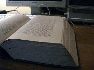
Firstly, there is the massive feel of this book. It measures 2 3/4 inch thick. At 6 x 8 1/2 inches, it sits well on my desk, open to any page.

Secondly, and more importantly, after the 568 pages of the text, then begins an astonishing 265 additional pages of explanatory notes. Many things obscure to us in the 21st century are revealed in the notes...

In the Moby Dick bookcase (maybe I will post some pictures of it in the future...), this book dominates the shelf it sits on, saying to the other editions: "move over guys, this is my space..."


Moby Dick


Next post: the oldest paper back in the collection.


Thursday, January 6, 2011

1922 The St. Botolph Society Edition, Moby-Dick

Moby-DickThe St. Botolph Society, Boston, published works thru the first half of the twentieth century.

Researching the St. Botolph Society revealed from their website that under "temporary chairmanship of John Quincy Adams, the name of St. Botolph Club was chosen, after the VIIth century abbot around whose monastery in the fens of East Anglia Botolph's Town, later corrupted to Boston, sprang up. Botolph became patron saint of Boston, England and his spirit latterly migrated to the new city in Puritan New England. He was known for his kindly spirit and good humor."

This volume is marked with a copyright to Elizabeth S. Melville and the date 1892. This copy is the eighth impression, Feb, 1922. Printed in Boston by C. H. Simonds .

The source of the 1892 text for Moby-Dick is something that my friend Dave is working on.. We think, currently, that SBS first published MD in 1919, and the 1892 text came from the United States Book Company.

I bought this book in 2003 on EBAY.

NEXT POST: "My favorite Moby-Dick."

Wednesday, January 5, 2011

2003 Russian Language Edition, Moby-Dick


Moby Dick
The 2003 Russian language edition of Melville's Moby-Dick, printed in Moscow, the Russian Federation, uses the Rockwell Kent illustrations from the 1930 Random House edition, which I find that fact amusing to speculate about.

Specifically, while I don't read Russian and the cryillic type is difficult to decipher, it does appear to me that nowhere on the title page or in the entire book for that matter, is there anything appearing to be an attribution for the illustrations, leading me to believe that there is some left-over soviet editor who figured since Mr. Kent was a communist, they could just requisition his work, as property of the state, so to speak. HAHA...


Also, I find it interesting that this book can no longer be found on line... Check: Amazon, ABE, and Paperback Swap

Next post, one of the older editions..

Tuesday, January 4, 2011

2007 Chinese Language Edition, Moby-Dick

Moby-Dick
Try and type in the google box: Chinese Edition of Moby-Dick. You will find its pretty much of a dead end. Actually, go to EBAY or ABE BOOKS and try to search for Moby-Dick in Chinese... doesn't really work.

After I bought the Japanese edition (earlier post), I decided I needed a Chinese edition... so on the next visit to my son's home in Brooklyn, I took a side trip to Canal St. to find Moby Dick in Chinese. Oh, that was a chore as well, try to google search Chinese Book Store in Manhattan...

While the clerk at the Kinokuniya Bookstore (Japanese Bookstore in NYC) knew what I was talking about... The clerk in the Chinese Bookstore had no idea what I was talking about. Granted if they asked me if I had an English edition of Dream of the Red Chamber I would have no idea... oh wait I have one... well anyway..

So, later I was sharing the Moby Dick collection with Adam O'Brien, Library Specialist at the Schaffer Library of Union College, and he took a keen interest in the foreign language section, he was able to get me the ISBN numbers for the Chinese editions:


However, searching the internet brought me only to Chinese bookstore websites only in China, and the google translate this was not very helpful.

Alas, this was taking more than a year now... I called the local bookstore, BOOKHOUSE and had a nice chat with them, gave me the name of a bookstore in Cambridge MA, that does a nice business in foreign language books, so I called them, the gent there said "sure no problem, we can get you one. Let me check on price and availabilty and Ill call you back." I am still waiting for that call... HAHAHA.

Dead ends abound, "Have ya seen the Chinese white whale" Nope, no, nyet .. but thanks to Adam I know it exists... I caught but a glimpse.

Enter my daughter, Sarah, over for a visit from Boston. While I was telling her this story, she said,"my colleague, Stephanie, was born in China, maybe she can help." Stephanie proved to be the key to this. Apparently, Sarah and Stephanie had a lot of back and forth about how to even translate the title "Moby-Dick" into Chinese to quiry someone in China, however she ultimately contacted a friend in Beijing who had a friend in Shaghai, and on Christmas Day, my daughter proudly handed me a DHL package... right from China.. and #72 was in it..

One interesting note about this edition, the text runs left to right, front to back. The Chinese Government, decreed that all books would be printed this way, not the traditional Top to bottom, back to front.. as the Japanese edition is.

SO, I am thinking .... I need an older version... maybe the 1994 or 1995 were printed top to bottom.. or an edition from Taiwan, or Korea.... ... hummmm mmm


Next Post: Moby-Dick in Russian with illustrations.


Monday, January 3, 2011

Graphic Novel, Moby-Dick

Moby-Dick
#71 is the 1999 graphic novel from Scholastic, part of the READ 180 series.

The Moby-Dick Collection will contain no abridged editions. - Part of the unwritten by laws of the Collection.

However, how could I turn this gift down? It was a Christmas gift from Sasha Schlegel my soon to be daughter in law. Special!

Sasha works in Manhattan at BrainPOP, animated science, health, technology, math, etc, and school homework help for K-12.. its her field!

Additionally, its not the first abridged, illustrated, children's edition of Moby-Dick she has given me, so now there is a small and growing section of modern children's Moby-Dick.


NEXT POST: another Christmas gift, unavailable on line and unavailable in the US.
The acquisition of this edition was a quest in itself.

Sunday, January 2, 2011

1933 Albert and Charles Boni, Inc. Immortality!

Moby-Dick
#29, the 1933 Albert and Charles Boni, Inc. illustrated edition.

I was given this Moby-Dick by Mark Scott, who was at the time a tenant of mine, and was attending the University at Albany Library School. He obtained his degree in Library Science and moved on.

Raymond Bishop is the credited illustrator, but a search of the web turned no references to this illustrator.

The book is inscribed by Katherine Benton, 22 April 1935 in a precise hand. Nicely done. A search of the web turned up no references to Katherine Benton.

According to his New York Times obiturary, Charles Boni, 1895 - 1965, and his brother formed the concern that bore their names from 1923 - 1928. Although this book is dated 1933, the New York Times states that the business "died in the stock market crash of 1929"

So, this copy, #29 in the collection, contains three mysteries to still be solved: who was Raymond Bishop? Who was Katerine Benton? and how did the defunct Albert & Charles Boni, Inc. publish this book 4 years after its supposed demise?

But a wider issue to be contemplated is this: Within this book is the immortality of Katherine Benton, save for this one notation, she may have slipped in to oblivion. Maybe not, there maybe family who know her story, and certainly, she may still be alive. But also, within this book, Raymond Bishops work, however brief, still exists, and the manufactured efforts of Albert and Charles Boni, and the workers who crafted this book, still exists.


Next: 2 posts, each of the Christmas gifts I received this year..

Saturday, January 1, 2011

A Gem! 1942 Everymans Library, Moby-Dick, J.M.Dent London


Distinguished Teaching Professor Hugh MacLean's personal copy of Moby-Dick.

Professor MacLean taught English at the University at Albany from 1963 to 1986. On the inside right cover is the following notation under his signature: "realized in Toronto February 1949", with the price of 2.56 in the top right, presumably Canadian. A biography of Professor MacLean, notes that he graduated from Princeton in 1940 and earned a master's degree and doctorate in English after the war at the University of Toronto, so this is his doctorate copy!

The book is riddled with underlining and notations. A sample: God in the whale: pgs 271, 315,170,469 and 46. Also, intriguingly, on the inside back cover he lists the 9 other ship mentioned in the book and the pages of the listing, with a note on each on how that ship relates to Moby-Dick.

Professor MacLean's published work Edmund Spenser

Next post: "Immortality!"