Showing posts with label 1950's. Show all posts

Monday, November 14, 2011

1950 Modern Library Edition Moby Dick

The dust jacket illustration features Ahab, left pegged leg, sighting his position by shooting the sun with a sextant.

This copy, near perfect, is the #119 in the Modern Library series, published in 1950, right after WWII, in time for the economic expansion of the 50's. TV's just around the corner.

Chapter XV Chowder

As its getting colder here in Albany, I reread this chapter, a chapter of warmth and comfort, for there is nothing more comforting to this old salt on a cold day than a cup, no a bowl, of clam chowder.."the whole enriched with butter, and plentifully seasoned with pepper and salt."

We love how Melville mixes it up: not salt and peppa but pepper before the salt. 

Chowder for breakfast, chowder for lunch, chowder for dinner, and never never never a red chowder, Manhattan chowder is not Chowder, I don't know what it is, but its not chowder.

1950 is the birth year of the editor of TMDC, and he too is shooting the sun to find his location.

Monday, September 5, 2011

1956 Riverside Edition Paper Back Moby-Dick

One of our favorite previous posts involved the 1956 Riverside Edition of Moby Dick from Houghton Mifflin.

Interestingly, here is a new addition to the collection, which for all intents and purposes is identical to the aforementioned book with the exception of the cover. A cover which is clearly not of the 1950's, yet no where within the book is an indication of the year of printing.

The book is a gift to TMDC from Ford Mclain, a local Albany, NY artist, the featured artist at a local art party recently.

This cover tells us so much more than the original edition:  The Riverside Editions, it is explained on the rear cover, are "a series of classic American, British and continental literature distinguished by its textual purity and authoritative editorial material."

Quoting again from the rear cover: "Moby Dick combines grandeur... friendship, tragedy with the intense anguish of a lonely human soul."  A fitting quote.

Tuesday, August 2, 2011

1956-Czech Language -Rockwell Kent - MOBY DICK

Rikejte mi Izmael.

Lets see: here is a beautiful edition of the 1956 Czech language Moby- Dick. Printed in Praque an imposing size and signed and book-plated (left)

Even 1956 has to be slap dab in the middle of the Cold War...

Getting the info from the sales description: Bila Velryba (Moby Dick) by Herman Melville. Illustrated by Rockwell Kent. Published in Praha (Prague) in 1956 by Statni Nakladatelstvi Krasni Literatury, Hudby A Umeni. .... 663 pages. Hardcover. 7" x 9.5." ... The book itself is clean and in very good condition. Light wear only to dust jacket with dust and short closed tear on white rear panel.

biela velryba

Monday, June 20, 2011

1956 Riverside Edition Paper Back Moby-Dick

Here is the 1956 Riverside edition, measures about 5 by 8.  Having attended highschool in the 1960's I had several classic books printed by the Riverside Press in Boston, listed as Riverside Press Cambridge. 
Notably, I had Jude the Obscure. Never touched it in highschool.  That book I choose to read the summer I got laid off from Norton Company, 1988.   

By the swimming pool at the country club, while I was working on buying the first of several businesses I would buy over the years, I read Jude the Obscure...  Ykes, what was I thinking?  Dark, depressing, wonderful...   I ended that summer with a nice tan.

Anyways I digress, the feel of these books captivated me and I bought anything printed in this series that I ran across in my travels. Currently, in a different section of the library I have a dozen or so titles, alas not Jude the Obscure. I tied up about a half dozen Riverside Press books neatly with hemp string and put that package aside in one of the moves I made after the divorce. Somewhere, somehow that package went missing and I have never seen it or Jude the Obscure since. 

Friday, May 20, 2011

1955 Pocket Library Paperback Moby-Dick

Our first idea for this post was the nice comparison of the cover art between this edition and the previous post.

Essentially, this is the same depiction of a whale destroying the whale boats with the whaling ship in the background, allowing the viewer to know that there is some measure of safety in the trade, despite the obvious dangers.

Yet, upon further review of the 1955 Pocket Library cover, we all agreed that there is a bigger issue here to be illuminated.

The cover price of the book is 35 cents. That lead to a lively discussion of money, wealth, financial security and ultimately things treasured. In 1955 the purchaser turned over, most likely, a quarter and a dime in exchange for this book, would this be the only purchase.

Today if we were to sell it we would accept as fair 35 cents for it. Hence it could be argued that the book held some of its original value over the decades. We all are aware obviously that the 35 cents today is worth a whole lot less than the 35 cents of 1955.

The coins tendered in 1955 would have been silver, and the coins received today would not. That alone would account for a huge different in the intrinsic value of the book, then and now.

Thus this book is illustrative of the importance of safe guarding ones investments. For over time, those investments degrade and lose their value, despite all efforts to the contrary. It is the natural order of the universe: decay with time.

Wether we are concerned with Moby-Dick editions or stocks, bonds, real estate, or silver one must keep an alert eye on ones investments, it is important not to let them lose value because there is no whaling ship out there to rescue you when your investments decay. The 35 cents of 1955 is not the 35 cents of 2011. Each one of us is captain of our own whale boat and solely responsible for those in it with us, trite as that and this post seems.

As this is published we are managing our elderly parents in the last leg of their voyage, and that makes us aware of our voyage and hopefully we manage that for our children, so that there is some treasure of love left for them.

Thursday, April 14, 2011

1956 L. W. Singer Company MOBY-DICK

This is one crazy cover. I love the type and it would appear that someone added that little color of red. This is the 1956 printing of the original dated edition of 1942 by the L. W. Singer Company from Syracuse, NY.

At one time it was $1.20 as marked in pencil on the inside cover. When it was for sale at the Bryn Mawr Bookstore it was marked at $.25.


Wednesday, April 13, 2011

1956 Houghton Miffflin Co. MOBY-DICK

Here is the 1956 paperback Houghton Mifflin Co edition of Moby-Dick.

Signed on the cover by the owner: Judith Spiegler.

The book is heavily water stained, and I have no idea where it came from. No doubt it was in the stock of the Bryn Mawr Bookshop in Albany, when I and 3 friends bought the store and renamed it the Larkstreet Bookshop. I then lifted it for the collection.

Judith began underlining and marking it right from the Table of Contents. And on the back end paper she began notes right at the top of the page written in pencil.

Here is an example of her underlining:
pg 222 Consider the subtleness of the sea; how its most dreaded creatures glid under water. Beside which she wrote: Sea-truth

Often a book will easily open to the last page read and this book opens to page 240, which coincidentally is the last page with underlining.

Here she underlined: go to the meatmarket of a Saturday night..... Cannibals? who is not a cannibal? Did she see humor in that? Irony?

Since this is the last underlining, I am going to say here she stopped. The semester was over, or she lost interest.

I searched the internet and came up with this PDF of a 2008-2009 Publication

The University of Chicago School of Social Service Administration
Reflections 1

Judith Spiegler Adler
A.M. ‘61
I graduated from SSA in ’61 with an A.M., after having
graduated from the University of Chicago College with a B.A.
in ‘59. ... I began to teach, first at Fordham,
then at the College of New Rochelle.

So timing was right for Judith Spiegler - Adler to be Judith Spiegler of my MOBY-DICK, she graduated from the University of Chicago College in 59. and she went on to teach in New York State first at Fordham and then a little closer to Albany at College of New Rochelle.

Ironic if my Judith is the Chicago Judith....

Friday, April 1, 2011

Undated: Thames Publishing Co. London

I have always wanted to live in a very large house, a house with so many rooms that some of the rooms I may not enter but once a year. I think its a psycological quirk of mine. I can imagine the wonder and excitement of entering room after room and trying to figure out: now what is this one for or who uses this utility room.

Anyway back to the Collection: this morning as I went to the shelves to find a book to blog about I came across this edition. I have no recollection as to when or where or even why I have this book... it was like entering that room in that huge house. I said cool, what is this?

Its small, has a really great piece of cover art. Its English! A search of the ABE Books, yield some dated ones, 1954, but they had blue boards and these are red. So I just randomly say 50's, if anyone has any definitive knowledge, comment for me.. thanks!

If you have a few extra moments, take a close look at the cover art: it shows a boat chasing a whale at the ready to harpoon it. Pretty dramatic really, but as I looked at it for a longer time, several things jumped out at me. First there is the problem of the whale, he has stopped running and turned to look at the boat, his eye is menacing... Second and more importantly, there is the problem of the rowers, there are six men in the boat, only 2 are rowing. there are two other men looking aft with nothing to do. I think really they should get out some oars, because this whale, perhaps its meant to be Moby Dick, clearly wants to do them some harm. One little harpoon is not going to do the trick here, this is not going to end well.......

Monday, March 7, 2011

1958 Hungarian Language Edition Moby-DIck

The 1958 Hungarian Edition of Moby-Dick, is alas, an abridged edition. The first line appears not to be the famous opening sentence and there appears to be no copy of the hymn.

The cover art is representative of the art, there is an interesting left peg legged Ahab, dressed like John Adams with a frocked coat, but study the cover for a moment, is that not the Scarecrow from the Wizard of Oz? It is perhaps Ishmael telling his tale years later at the Spouter Inn, but his buggy eyes say it all...

Friday, January 7, 2011

1952 Hendricks House Edition, Moby-Dick

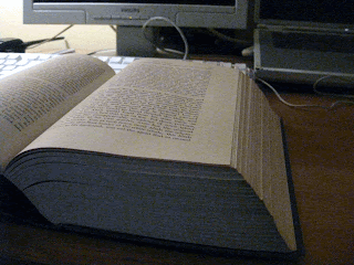
Moby-DickHere is the 1952 Hendricks House edition, which is by far my "favorite" edition of Moby-Dick. As a collector, I have multiple favorites, but when pressed by folks, this is one of my top favorites, at least it is the one I go to when reading the novel.

Firstly, there is the massive feel of this book. It measures 2 3/4 inch thick. At 6 x 8 1/2 inches, it sits well on my desk, open to any page.

Secondly, and more importantly, after the 568 pages of the text, then begins an astonishing 265 additional pages of explanatory notes. Many things obscure to us in the 21st century are revealed in the notes...

In the Moby Dick bookcase (maybe I will post some pictures of it in the future...), this book dominates the shelf it sits on, saying to the other editions: "move over guys, this is my space..."


Moby Dick


Next post: the oldest paper back in the collection.